The Weavers House
The Weavers House sits in the historic heart of Spitalfields, east London. Our approach was to reinterpret its Huguenot heritage with a sensitive, contemporary vocabulary. Peeling back the layers of time to celebrate the building’s existing charm, we combined traditional materials, techniques and colour with open spaces, clean lines and considered details.
Home Highlights
Huguenot Townhouse arranged over 6 floors. 4 Beds / 4 Baths / Kitchen / Dining / Living / Study / Card Room/ Cinema Room / Hammam
Location
Spitalfields, London
Completion
2016
Area
3250 ft2 / 302 m2
Availability
Soldi
Love this house but it's sold? Register your interest on our future projects and we will contact you when the next one is available.
Submitting—please wait.
—You are all set, we will be in touch.
—There was a problem submitting your email. Please reload the page and try again. If issues persist, please email us at hi@chanandeayrs.com.
You live in each of your projects – how did you come to live in this area?
Zoe became pregnant with our daughter, Max, and so we longed to live in a house, rather than an apartment. For as long as we can remember, Merlin has wanted to live in Soho. He grew up in the countryside and so was attracted to the idea of being right in the thick of it.
The problem with Soho is that it’s quite established, and there aren’t as many opportunities for development. Spitalfields offered the intensity of feeling right in the heart of the city, the creative energy that we’re always attracted to, and the possibility of a house.
We were specifically drawn to a series of streets lined with Huguenot buildings. Walking down the road felt like entering a time capsule.
What’s the story behind the houses?
The Huguenots were a community of French Protestants who escaped prosecution by fleeing to London. When they arrived, they used their wealth from their dealings in the silk trade to build these beautiful houses, the only ones in London to have outward facing shutters – a French tradition.
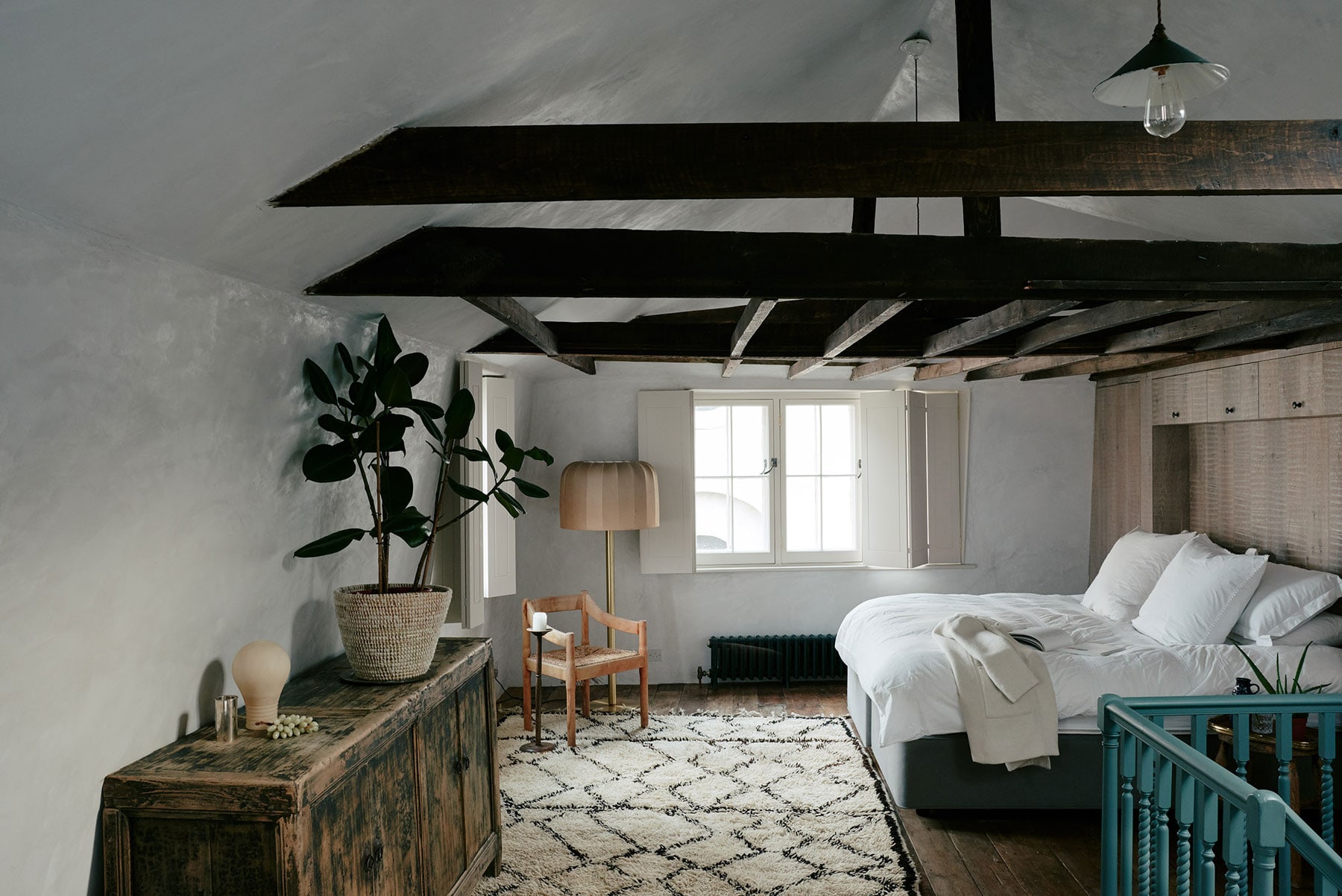
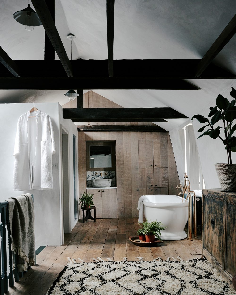
The houses are defined by their internal wood panelling and beautiful carpentry on the staircases. They also have amazing loft spaces, which is where the Huguenots had their silk looms – an early live/work typology.
We completely fell in love with the romance and character of the houses and the area. We were also drawn to their more recent past, in which artists and art historians such as Dan Cruickshank, Marianna Kennedy and Jocasta Innes helped save the houses with the Landmark Trust in the 1960s and 1970s. There was a whole band of them who lived in the houses and preserved them, which is a concept that really resonated with us.
What was the story behind the house you lived in?
Our house was on a corner plot and it used to be a pub called the Three Tun Tavern. Then, because there was a fruit and wool market nearby, it had been used as a kind of warehouse and forklifts were driven in and out of the ground floor.
The late grotto maker Diana Reynolds then owned it, and she ripped everything out and completely renovated it in the 1990s. We were attracted to the fact that the house had no original features because it allowed us to reimagine the interiors, while also responding to the historic shell of the building.
And what was your response?
We became friends with the artist and designers Marianna Kennedy and Jim Howett, who had worked on a number of renovations in the area. They showed us some of them, and we also made friends with our neighbours.
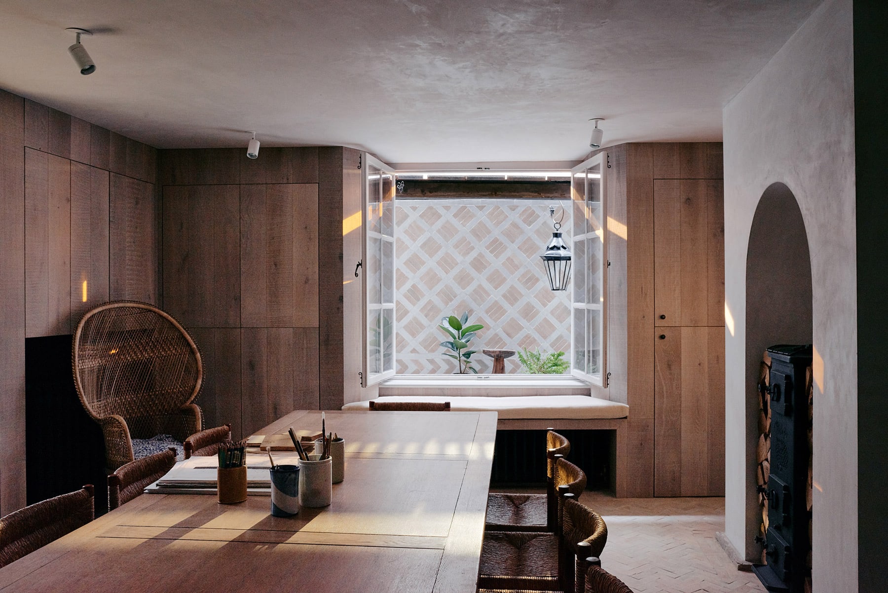
What we took away from all of the houses that we went into was how the original panelling, walls, doors and cabinetry formed a uniformed expression through consistent application. From seeing that, we knew we wanted to create a contemporary version of the wood panelling.
How did you achieve that?
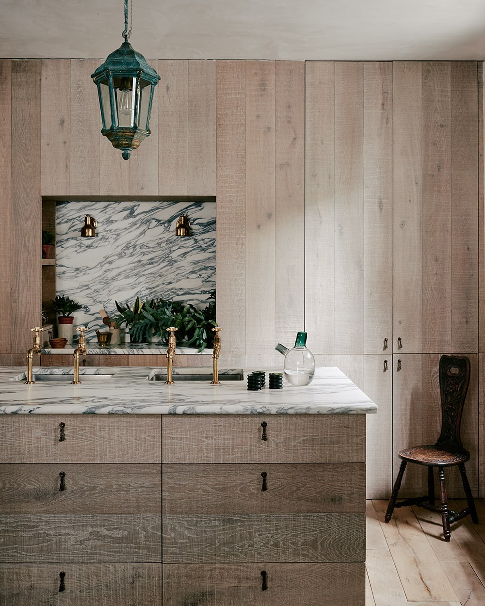
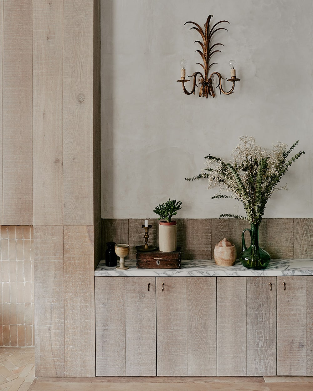
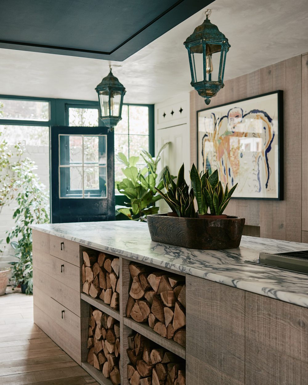
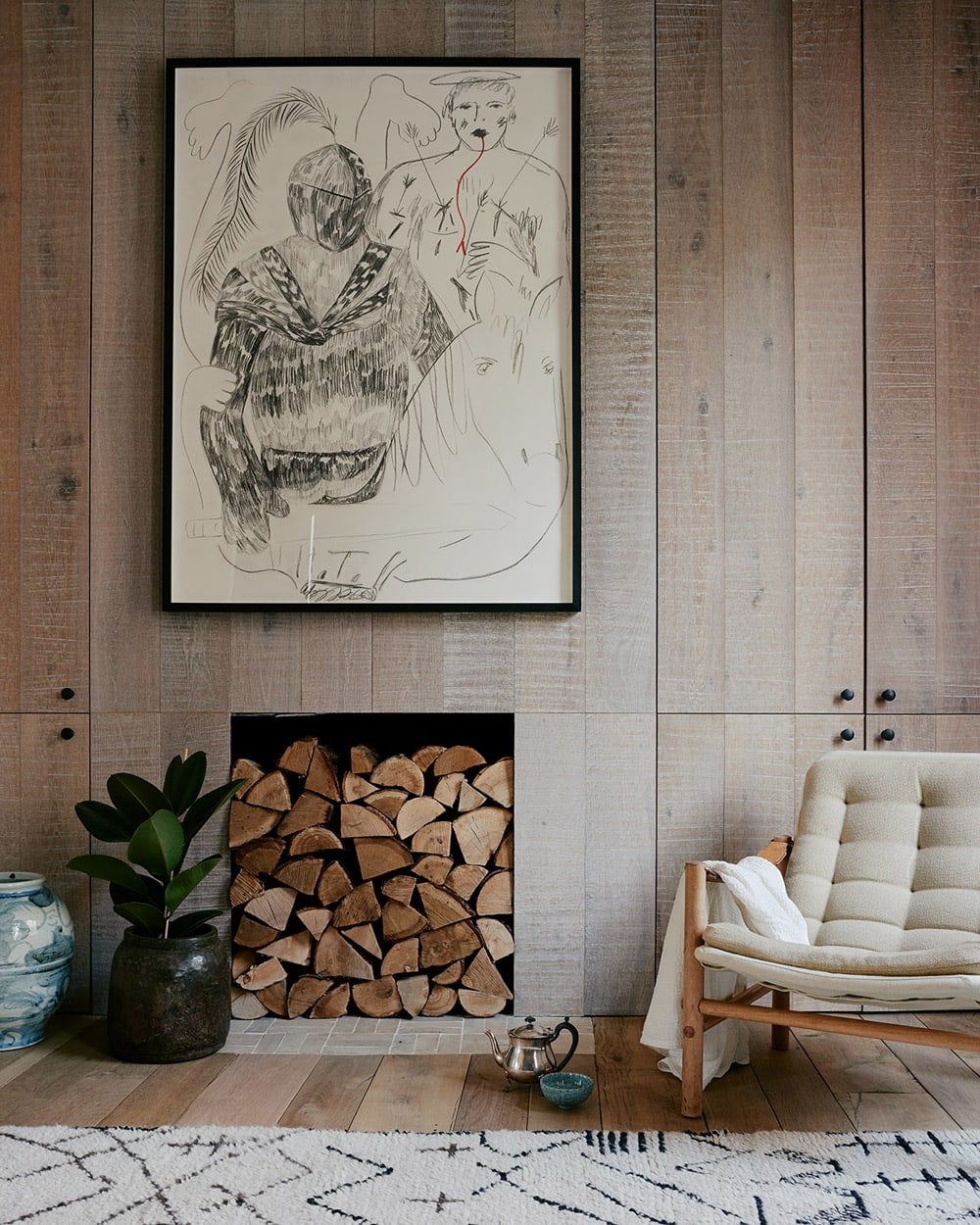
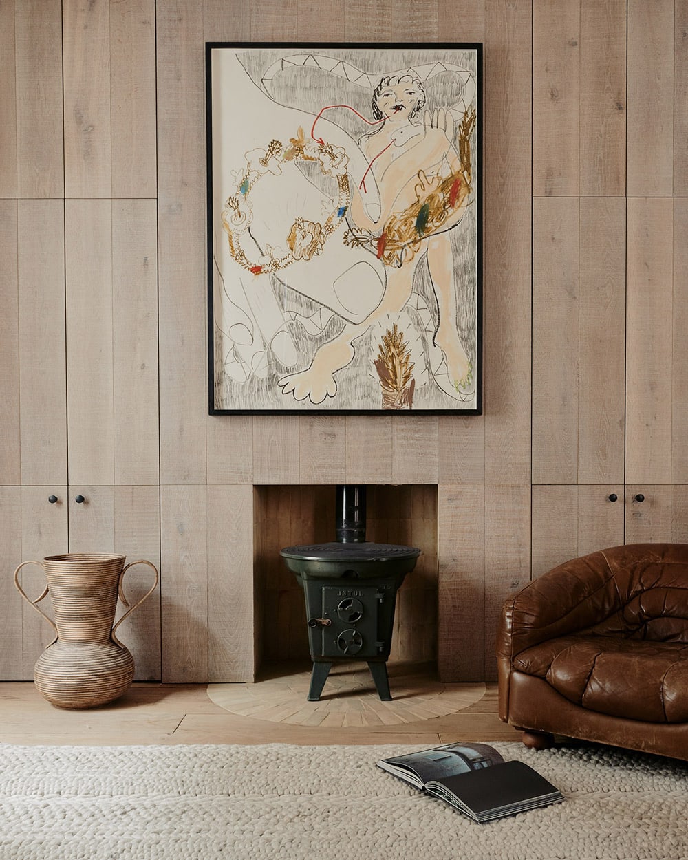
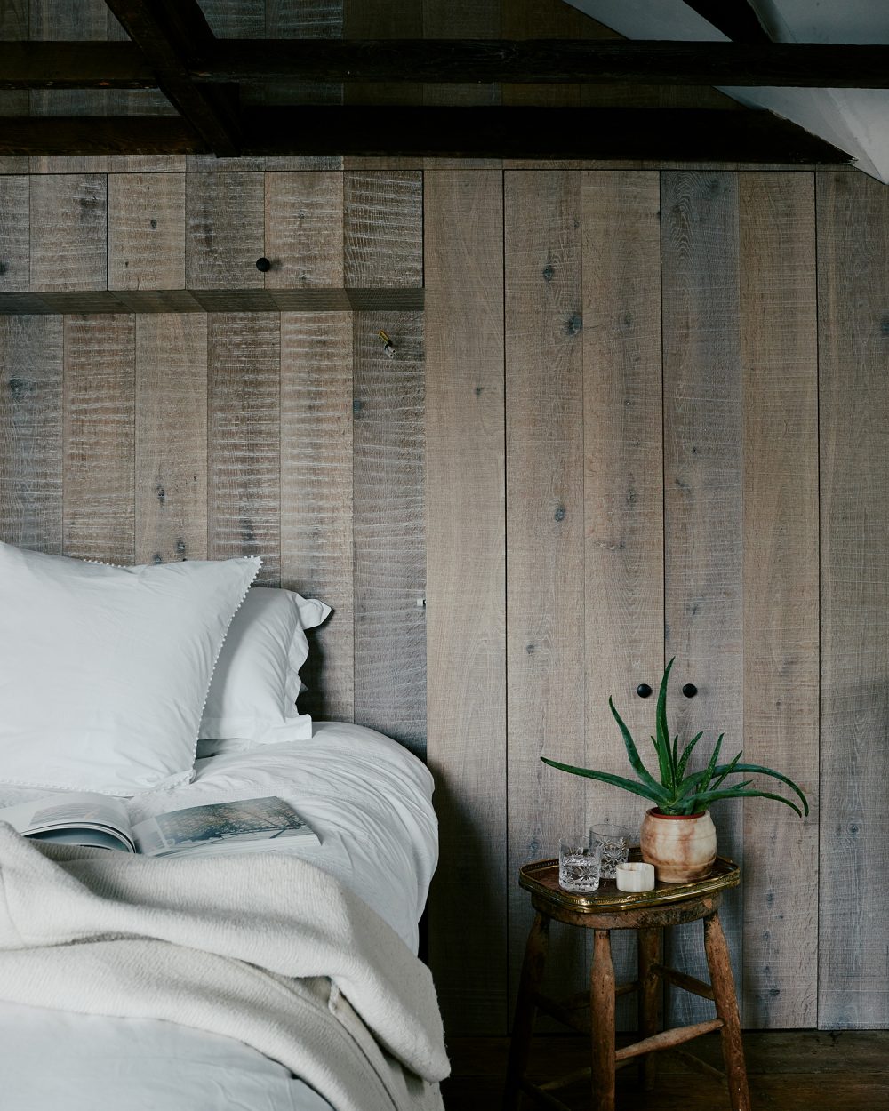
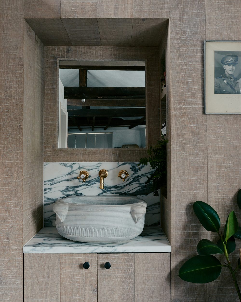
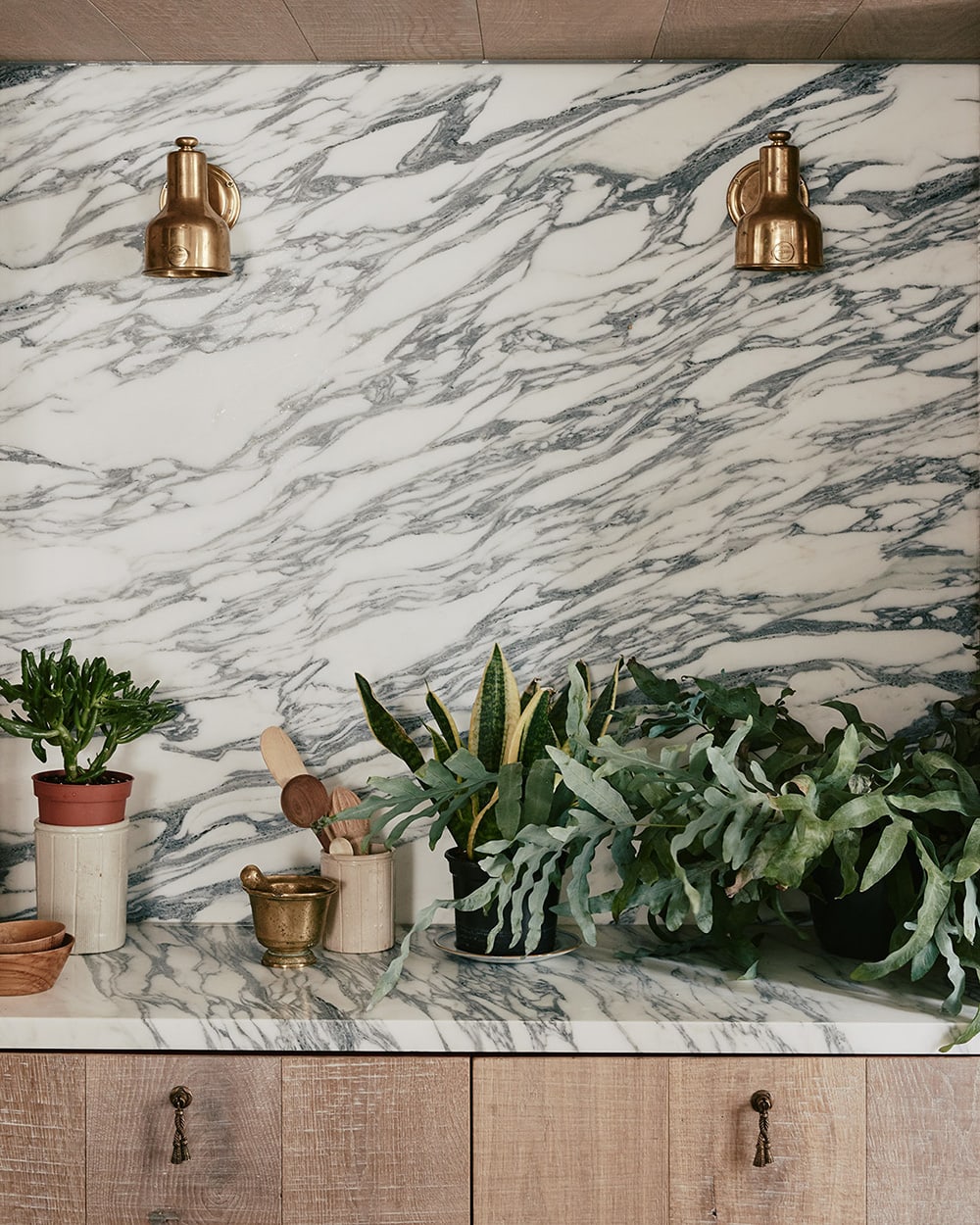
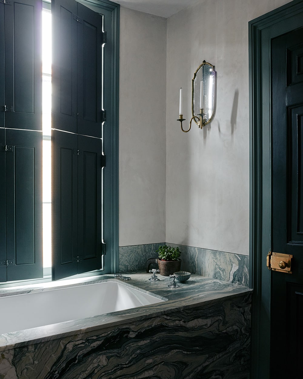
We wrapped the interior of the house with soft lime plaster and tactile sawn oak dados to echo the traditional wood panelling found in neighbouring properties. The oak also formed all of the cabinets, and the entire kitchen became an exercise in using that panelling as extensively as possible, from the kitchen island to the recesses and the dados.
So, it was like the entire house was a bespoke lesson in carpentry and history. If each of our projects is a mini-thesis on something different, this one was very much our module in historic buildings.
How else was the project unique from your other ones?
Because we were working with a pre-existing building for the first time, the challenge was thinking about interiors from an architectural perspective.
Interiors are not just about the surface. You’re still shaping an internal volume, you’re just not expressing the external form. So, our question was how can we really animate spatial and architectural moments in small details?
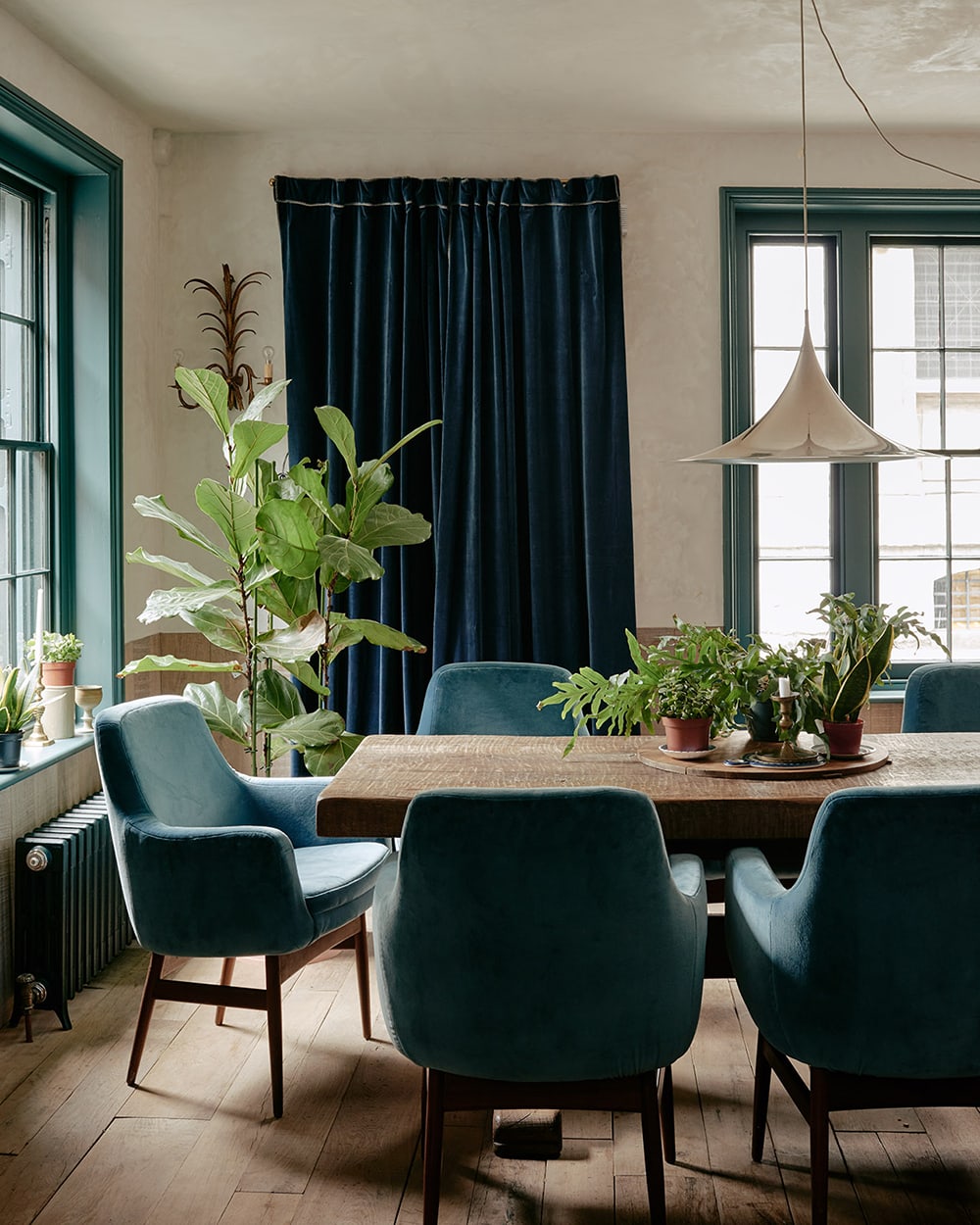
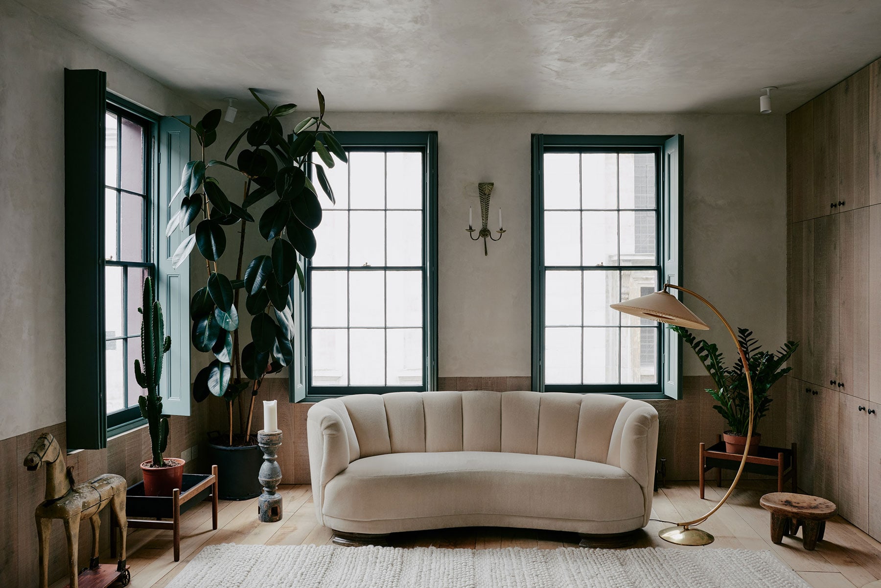
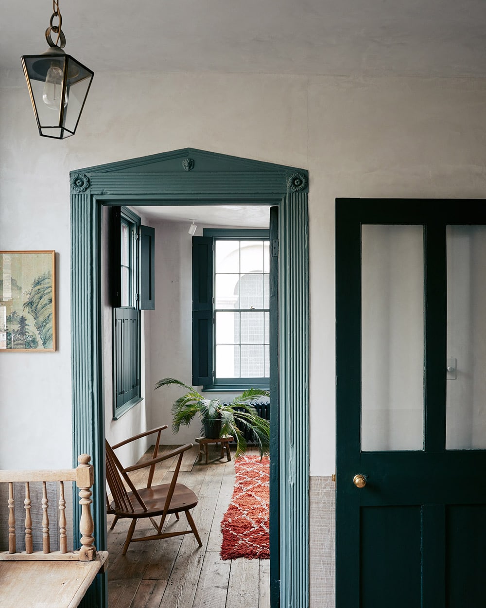
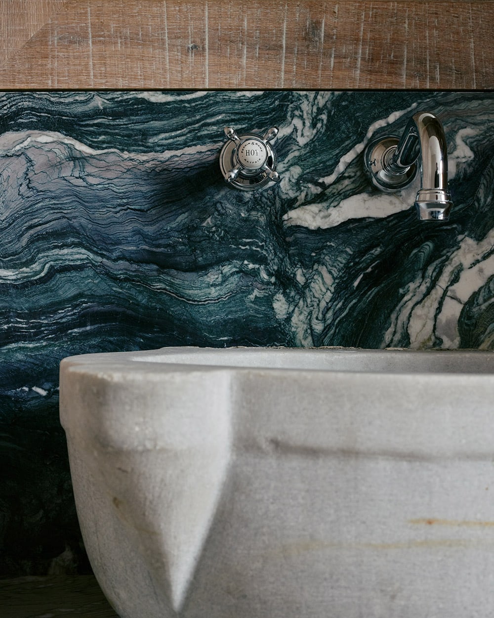
It was also a project where we consciously used colour for the first time. The Huguenots houses all possess quite a lot of character through their use of colour, which is one of the things we loved about them. We imbued the project with its own personality by responding to the lack of nature in the area, incorporating green and blue shades throughout.
How did you emotionally engage with the project?
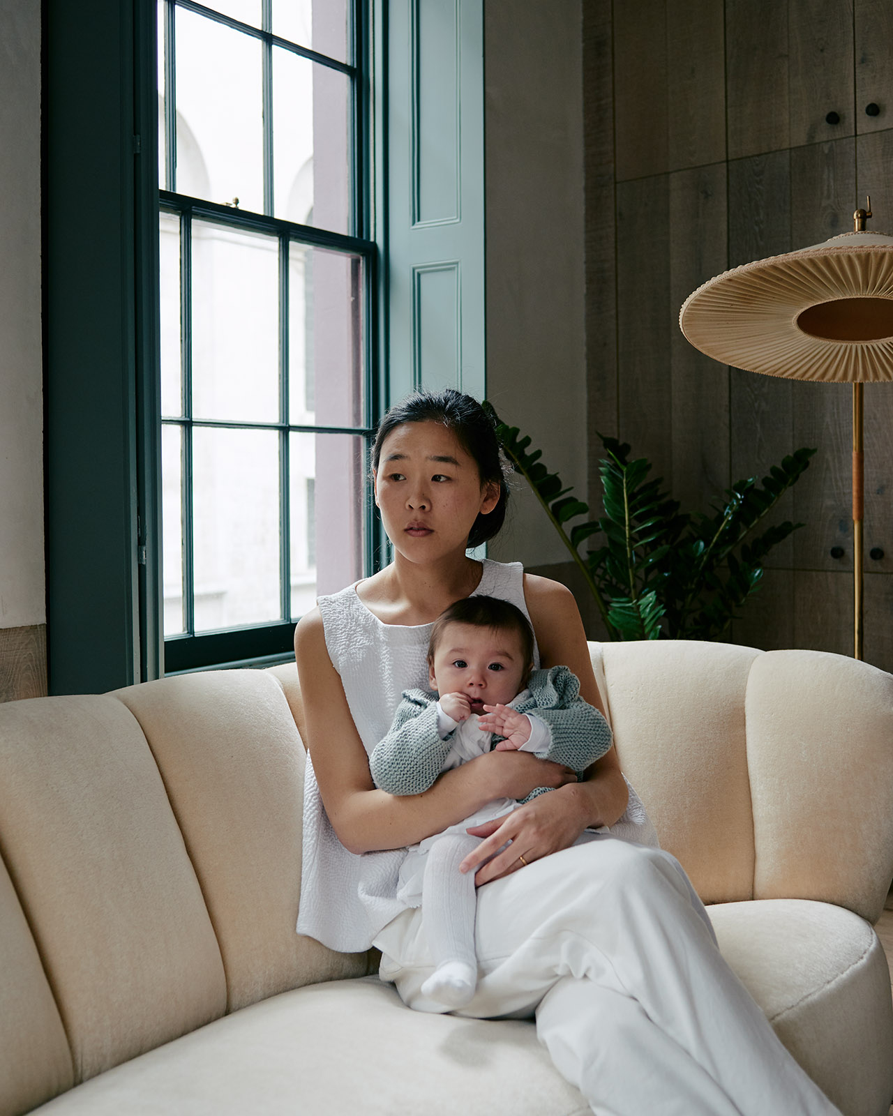
It has a special place in our hearts because it was the first place we lived as a family with Max. The process of making it was not only labour intensive, it was also quite emotionally charged because we knew we had a baby coming.
When Max arrived our time in the house was so idyllic. It felt like we had built a nest for our family with a lot of love, time and dedication.
Team: Zoe Chan Eayrs / Merlin Eayrs
Photos by Michael Sinclair
Film by Toby Lewis Thomas