The Beldi
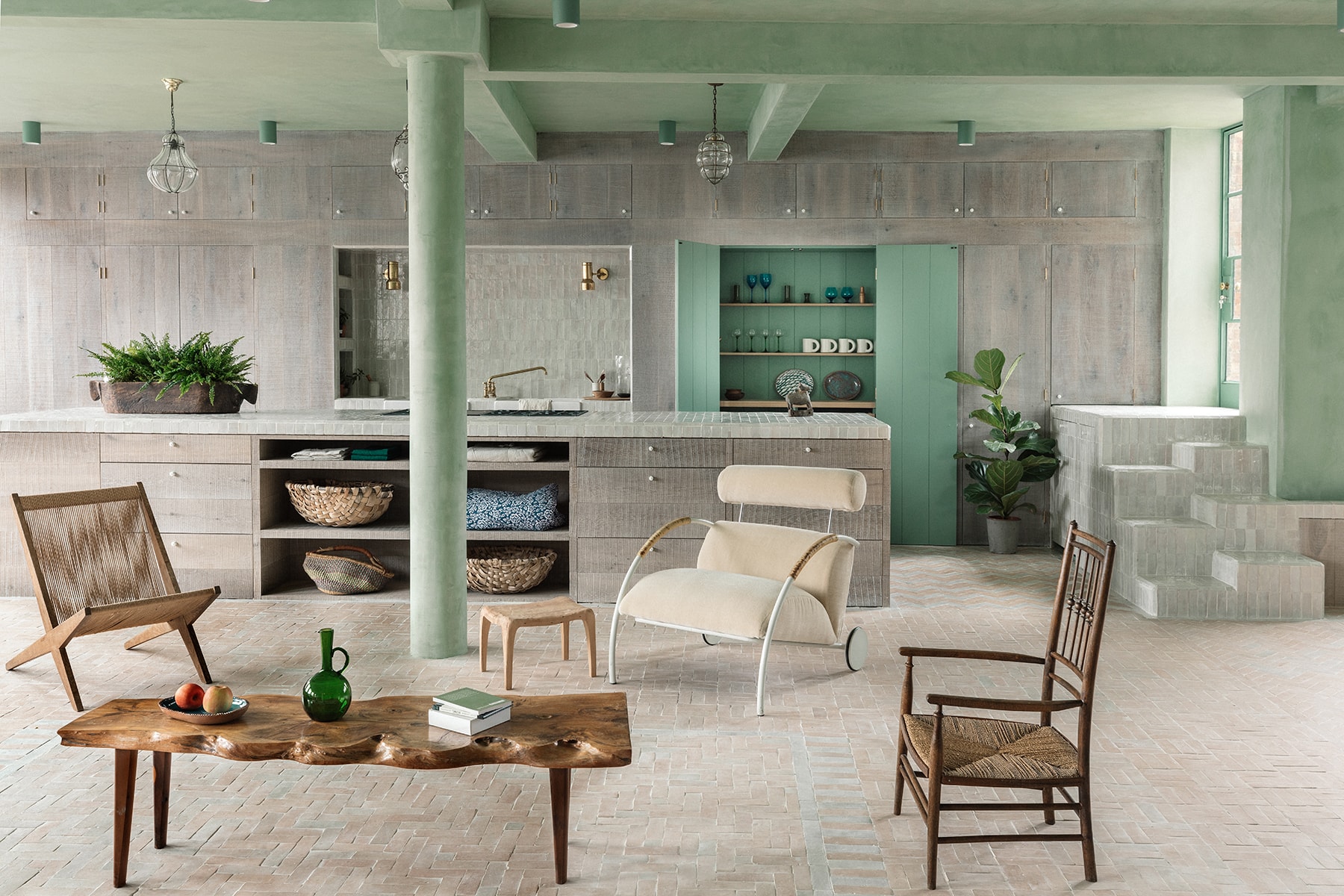
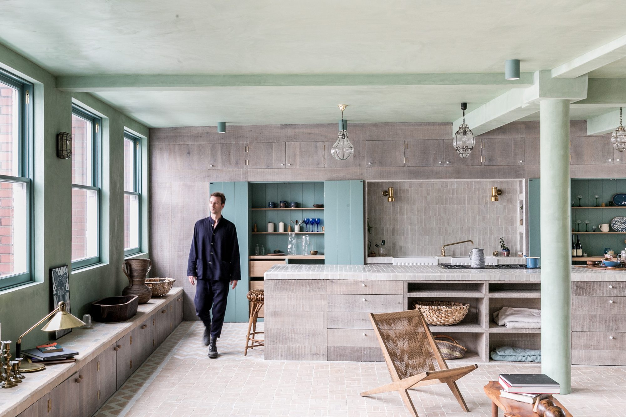
The Beldi is a converted loft space in the heart of Shoreditch, east London, overlooking St Leonard’s Church and its surrounding treetops. The light and open plan of the space reflects its history as a shoe factory, and the patterned use of handmade Beldi tiles is used to delineate the space within. Simplicity and craft come together in this verdant volume, forming an oasis from the urban jungle below.
Home Highlights
Converted quadruple aspect share of freehold loft space arranged over one lateral floor plate. 3 Beds / 3 Baths/ Kitchen / Pantry-Utility room / Study / Dining / Entrance area
Location
Shoreditch, E1
Completion
2018
Area
2,850 ft2 / 265 m2
Availability
Sold
What drew you to Shoreditch?
We were drawn to Shoreditch because of its energy. It feels like one of the most exciting and dynamic areas in London at the moment and we wanted to live right in the middle of it.
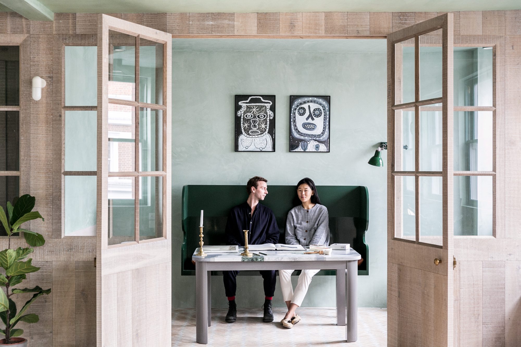
It’s so central and is a hub for younger industries, technology and creative businesses, as well as many independent restaurants, bars and shops. For those reasons, we found it a stimulating place to be based as a young, creative couple.
What is special about this site?
We love the warehouse buildings found in this post-industrial area of London. We looked at a lot of warehouses in Shoreditch, but many of the loft spaces we saw had been subdivided into smaller units or were extremely dark and deep in plan.
This site is rare in that it occupies an entire floor of a converted factory building, and has 30 original Crittall windows on all four sides, which flood the space with natural light. The building is also adjacent to St Leonard’s Church and the loft has incredible views over the treetops and church.
What were the driving concepts behind The Beldi?
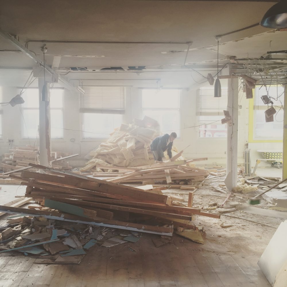
Our first intention was to make the most of the loft’s quadruple aspect and lateral volume. When we bought the space it was subdivided into many different rooms, and it was impossible to appreciate the lateral quality and multiple aspects of the loft.
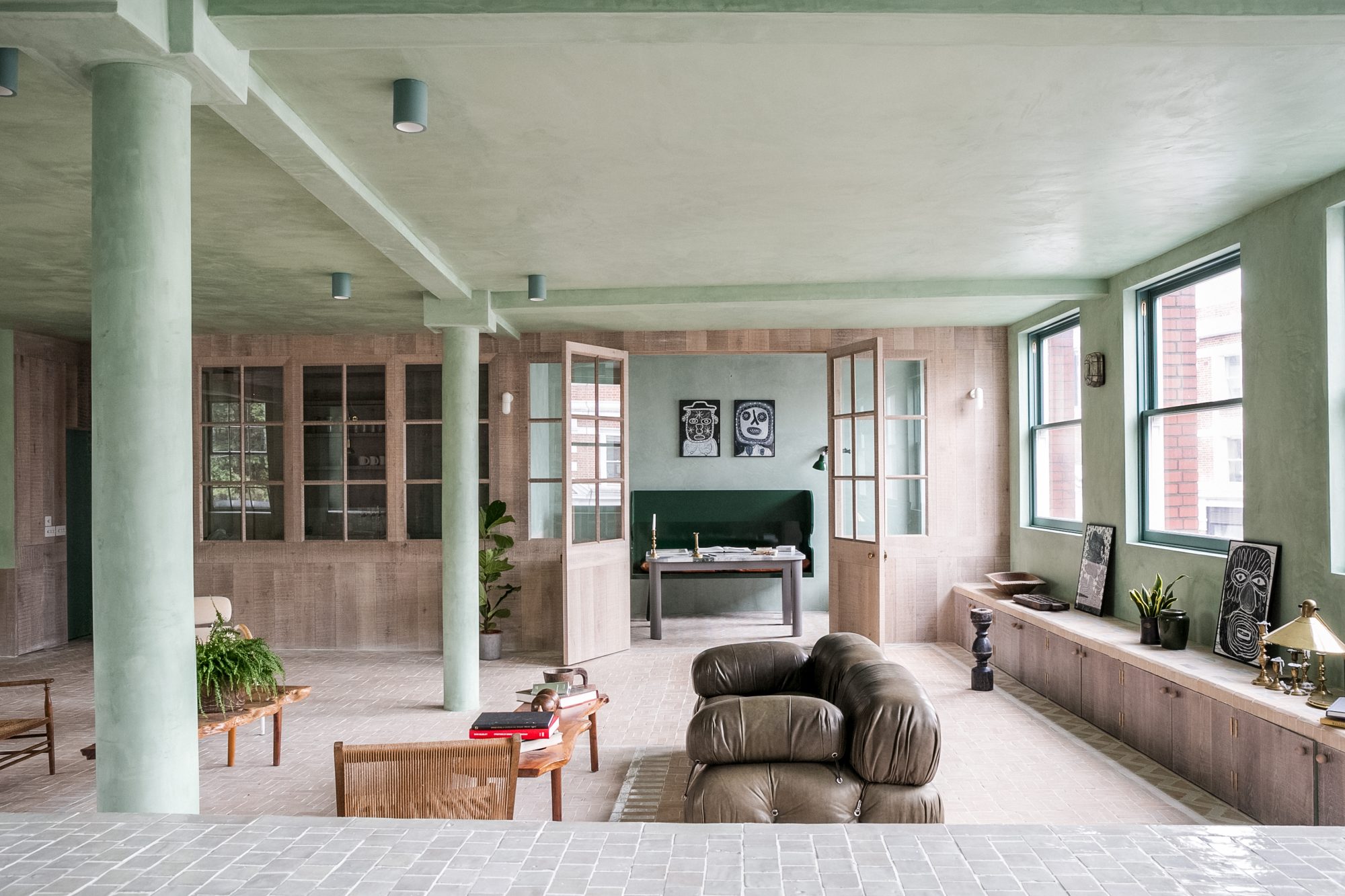
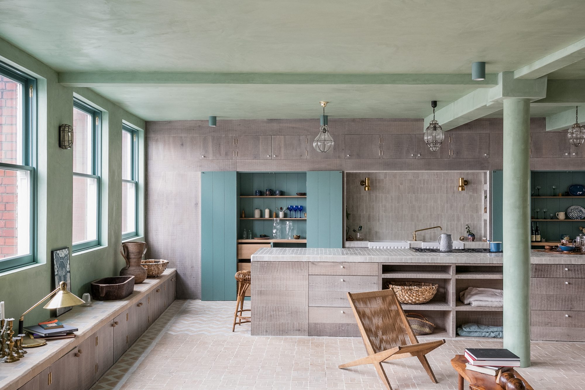
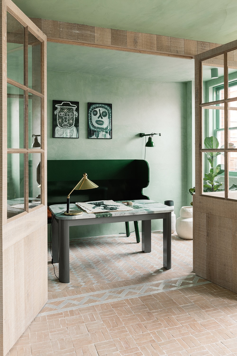
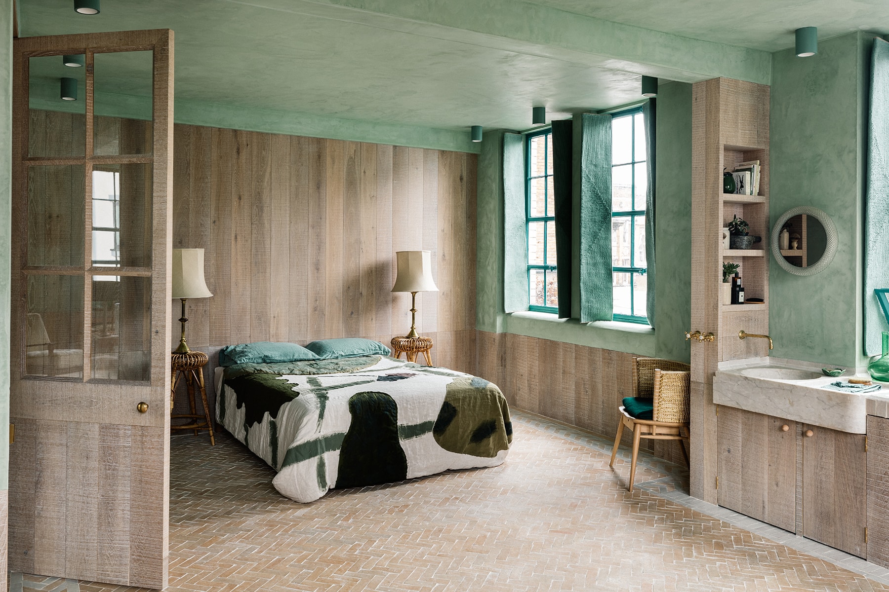
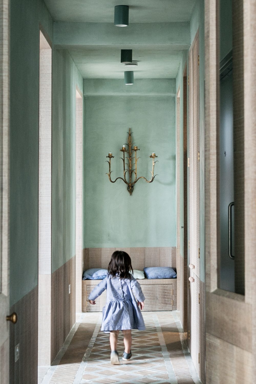
So, the first thing we did was to take out all of the walls, and we lived in the empty space to understand the light volumes and temperature at all times of the day. True to its original form, we designed a home with a very open layout, delineating ‘rooms’ through shifting patterns and borders in handmade clay tiles on the floor instead of conventional walls.
We also found the views towards St Leonard’s church and the treetops surrounding it very inspiring, as they are such a beautiful contrast to the very urban landscape at street level. We loved that when you are up in the loft you almost feel like you are in a tree house. To echo and amplify the verdant views out of the windows, we developed a palette of soft greens and blues inside. Home for us is a feeling of safety and retreat and we wanted The Beldi to feel like an oasis from the urban jungle below.
Can you elaborate further on the colours and materials you used in The Beldi?
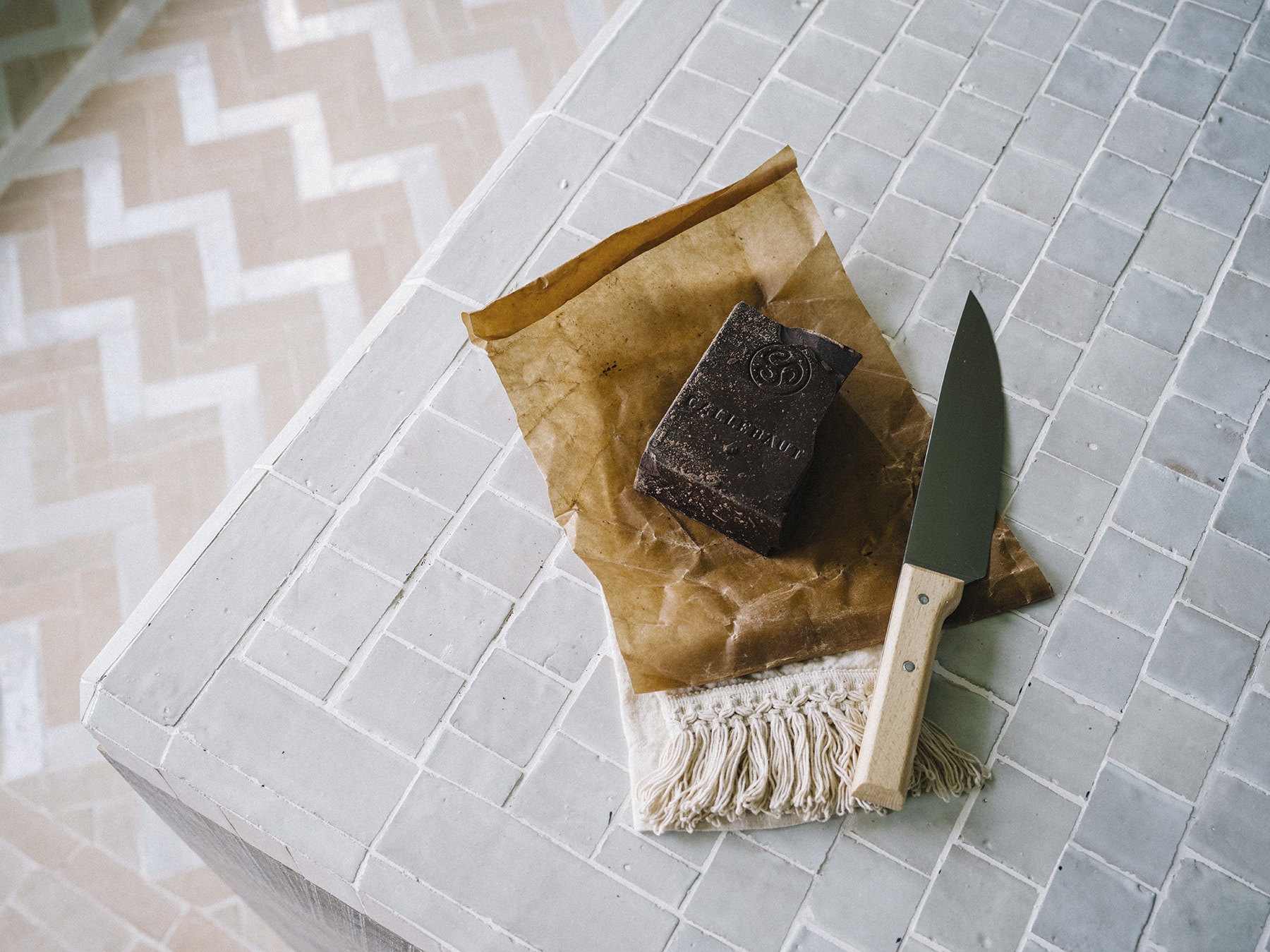
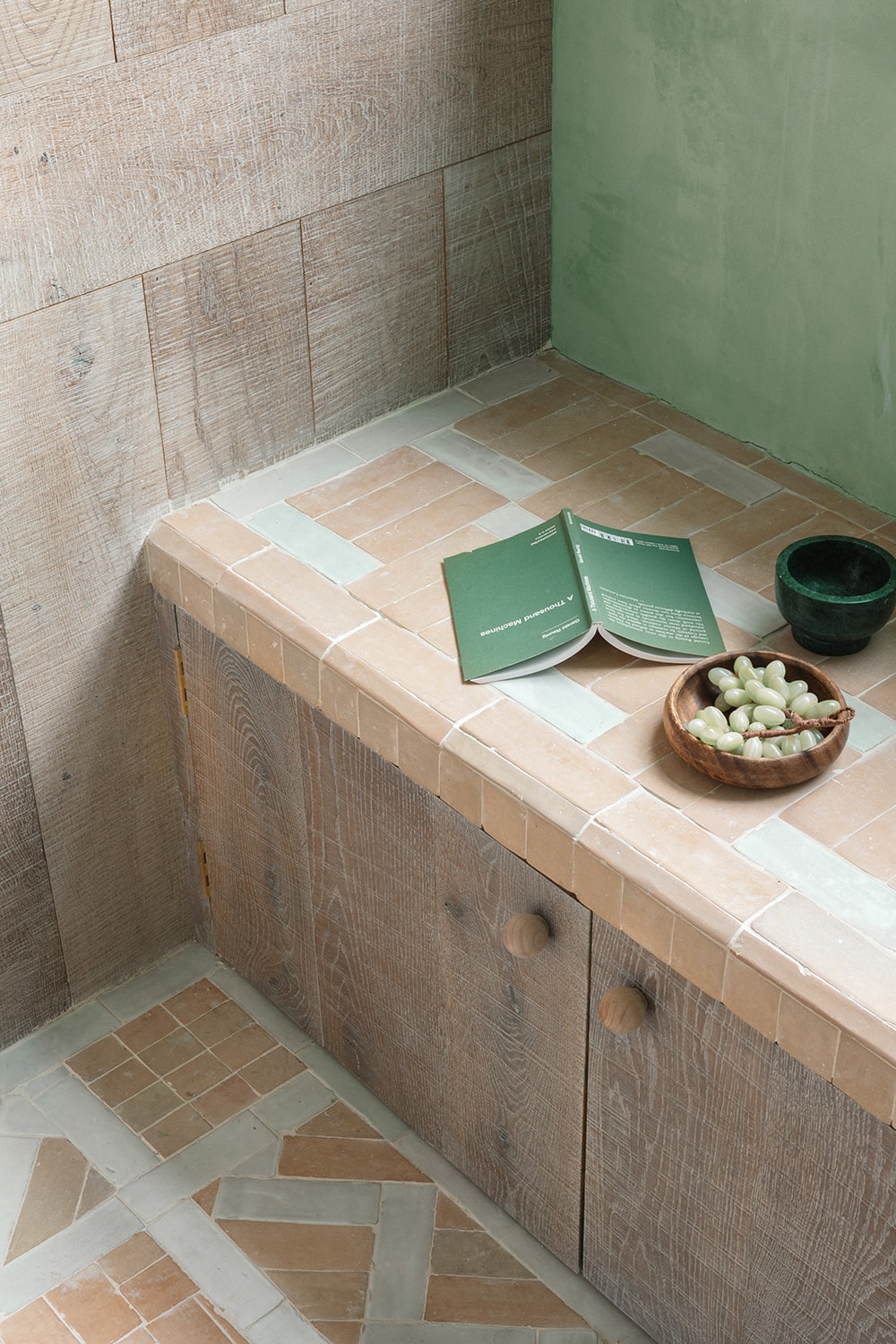
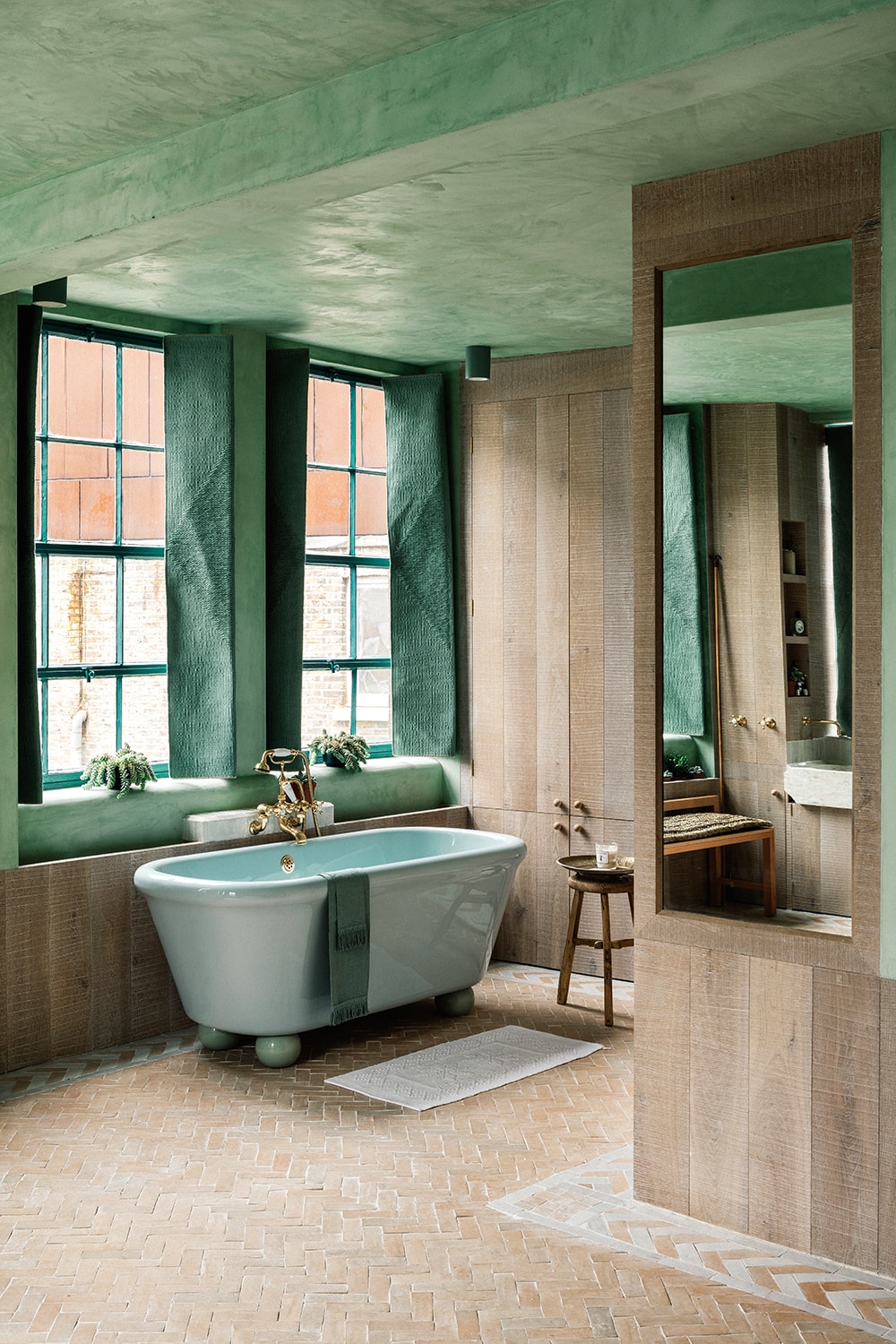
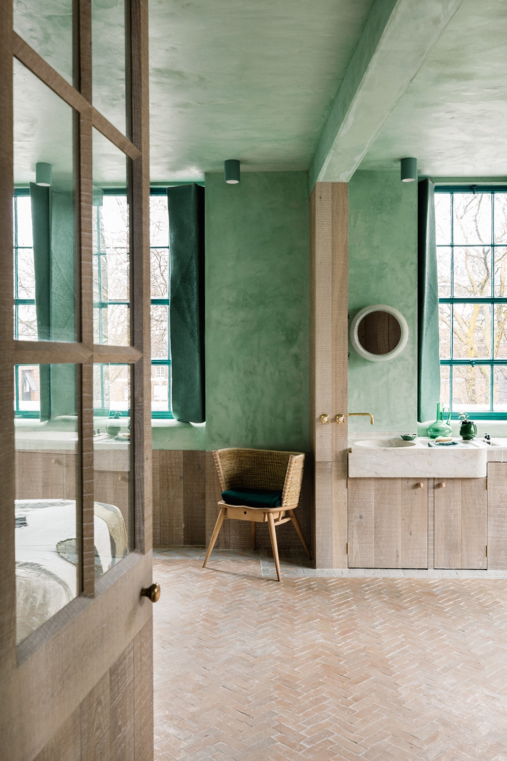
The patterns and borders on the floors were a key device in delineating ‘rooms’ or zones without the need for walls. The floors were crafted out of handmade Moroccan Bejmat Zellij tiles in their natural terracotta form, and also a glazed white version.
Our choice of material was inspired by our travels around Morocco and the riads we visited in Marrakech, where we got married. These tiles were then laid out in Herringbone and Basketweave patterns, and interlocking geometries found in traditional courtyard houses in Suzhou, China, where we have travelled with our young daughter, Max. Casting your eye across the floor is like reading a woven visual map of our travels and history.
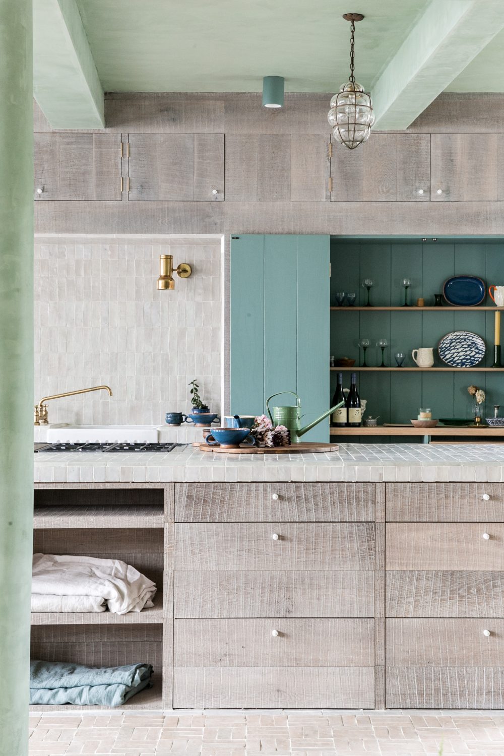
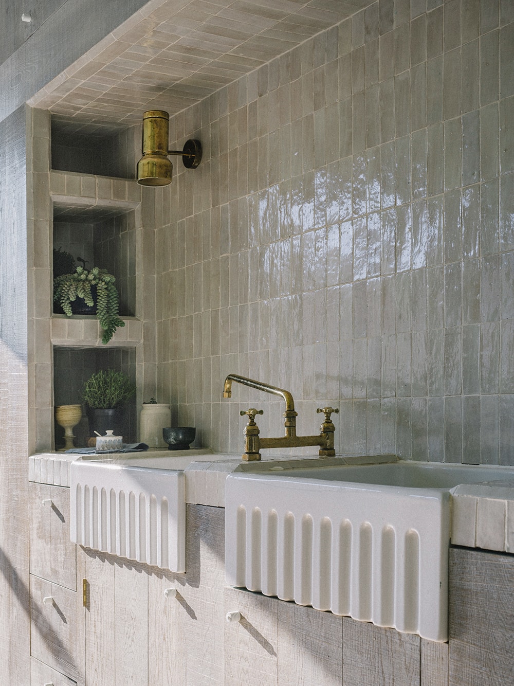
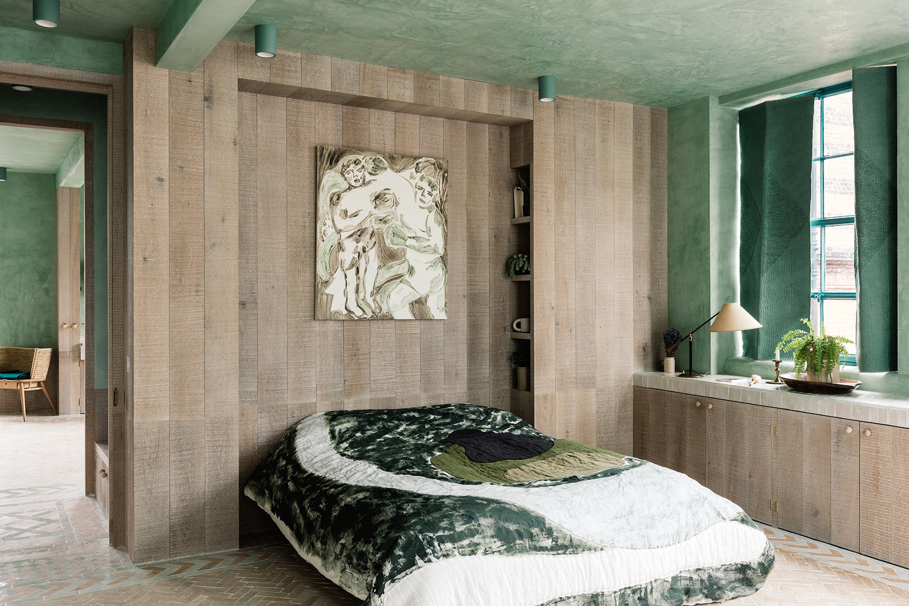
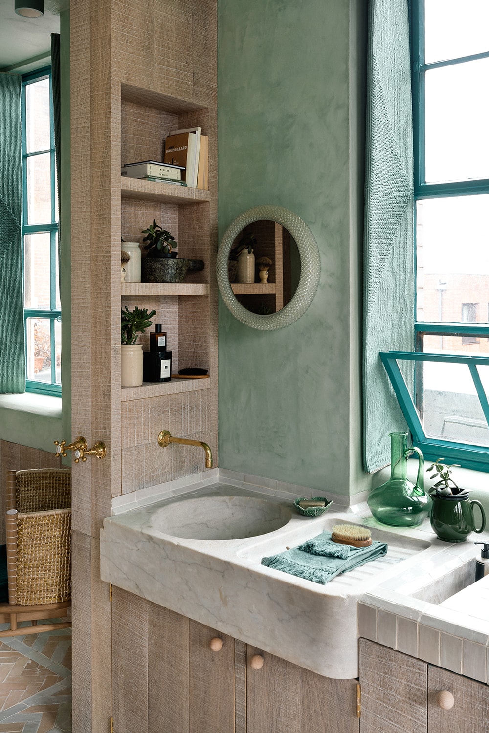
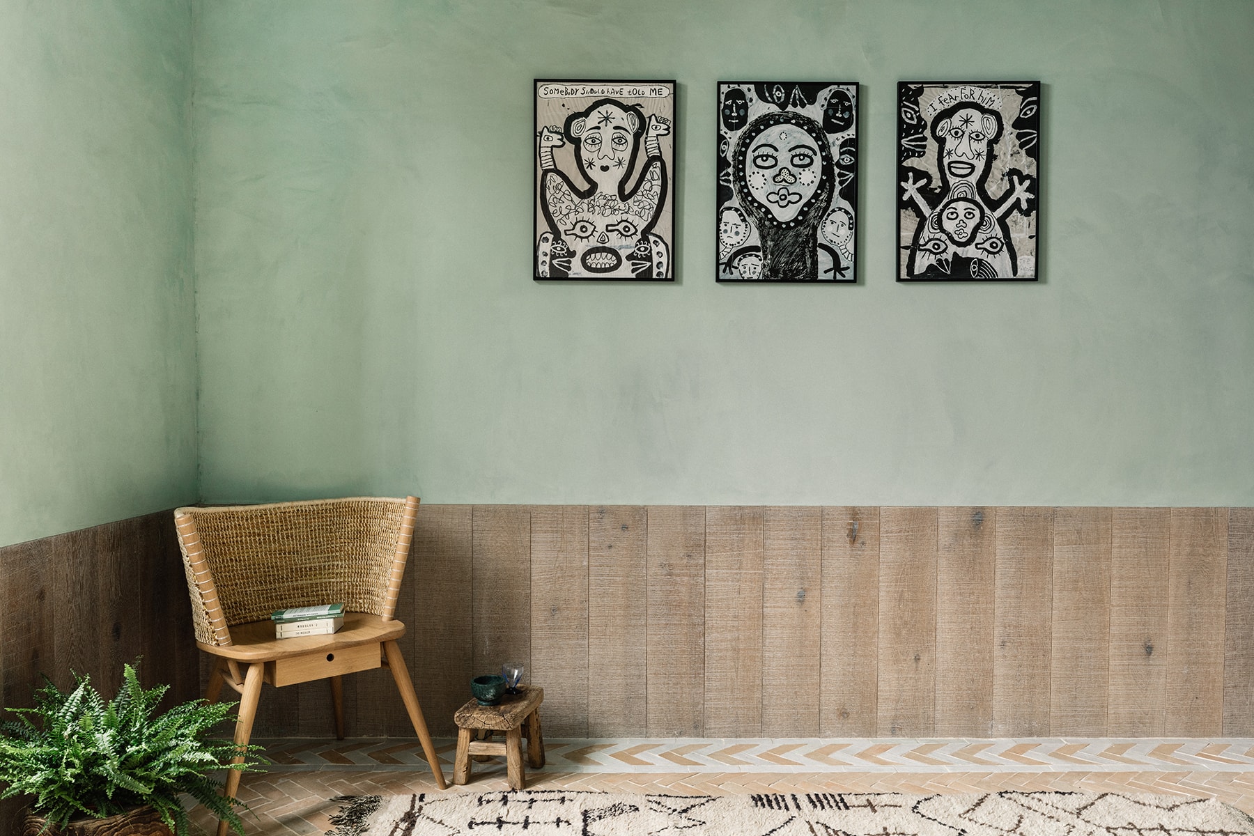
We love nature and the beauty of natural pigments and colours so, like all of our other projects, The Beldi’s material palette is quite earthy and soft. To echo the verdant views outside, we used traditional lime plaster mixed with a natural green pigment on the walls, which creates a soft and tactile feeling to the space.
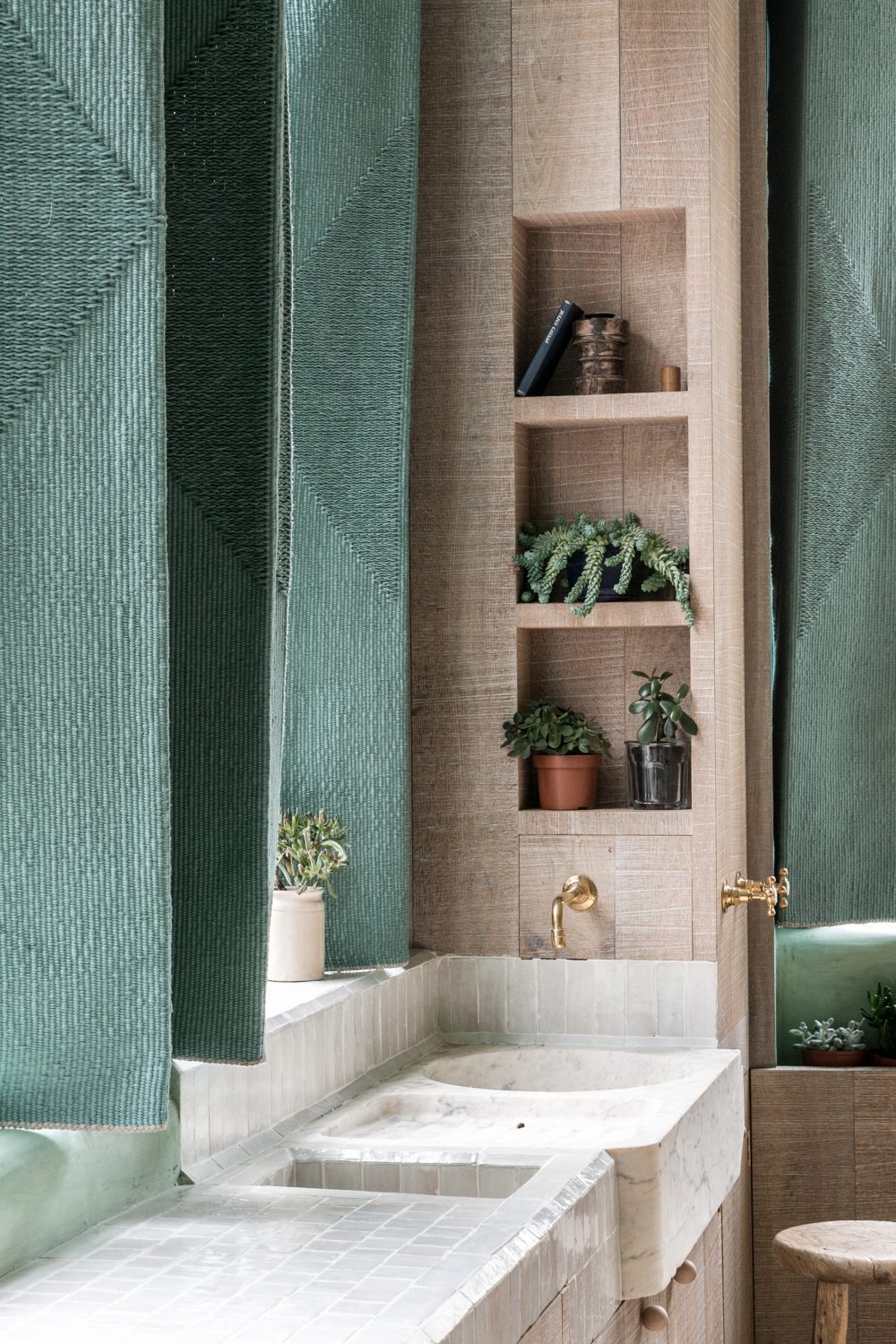
Linen shutters in a deeper shade of green were designed in collaboration with weaver Christabel Balfour and were made on her loom with brackets we welded ourselves. The weave had to be dense enough to block out the light but soft enough to be folded back, while the actual pattern of the weave picks up on the motifs found on the floor.
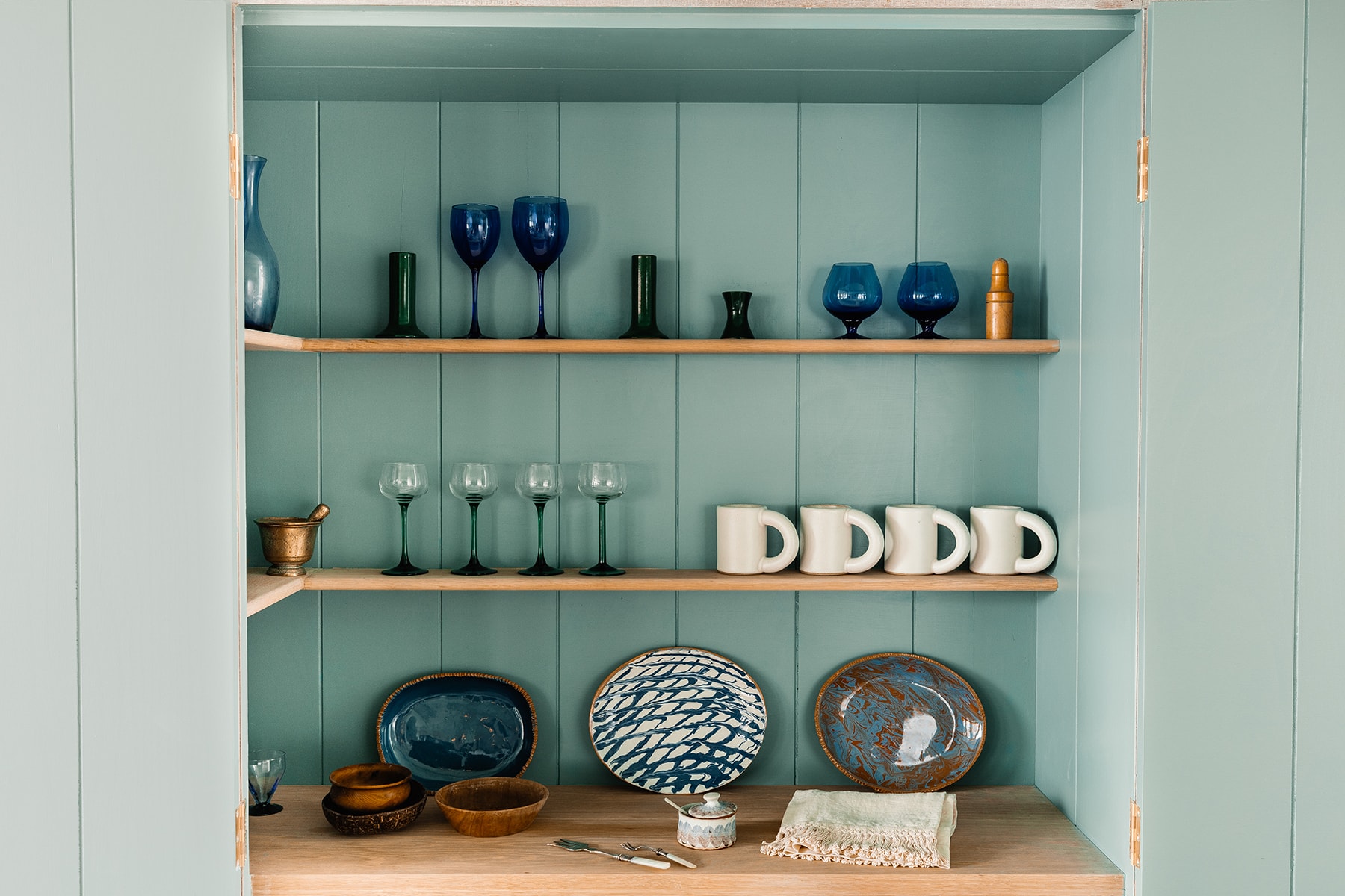
Additional layers of green and blue recur within in details like the fennel-green painted Crittall window frames; the painted cabinet interiors; an array of plants, glassware and ceramics; The Water Monopoly bathtubs and artworks.
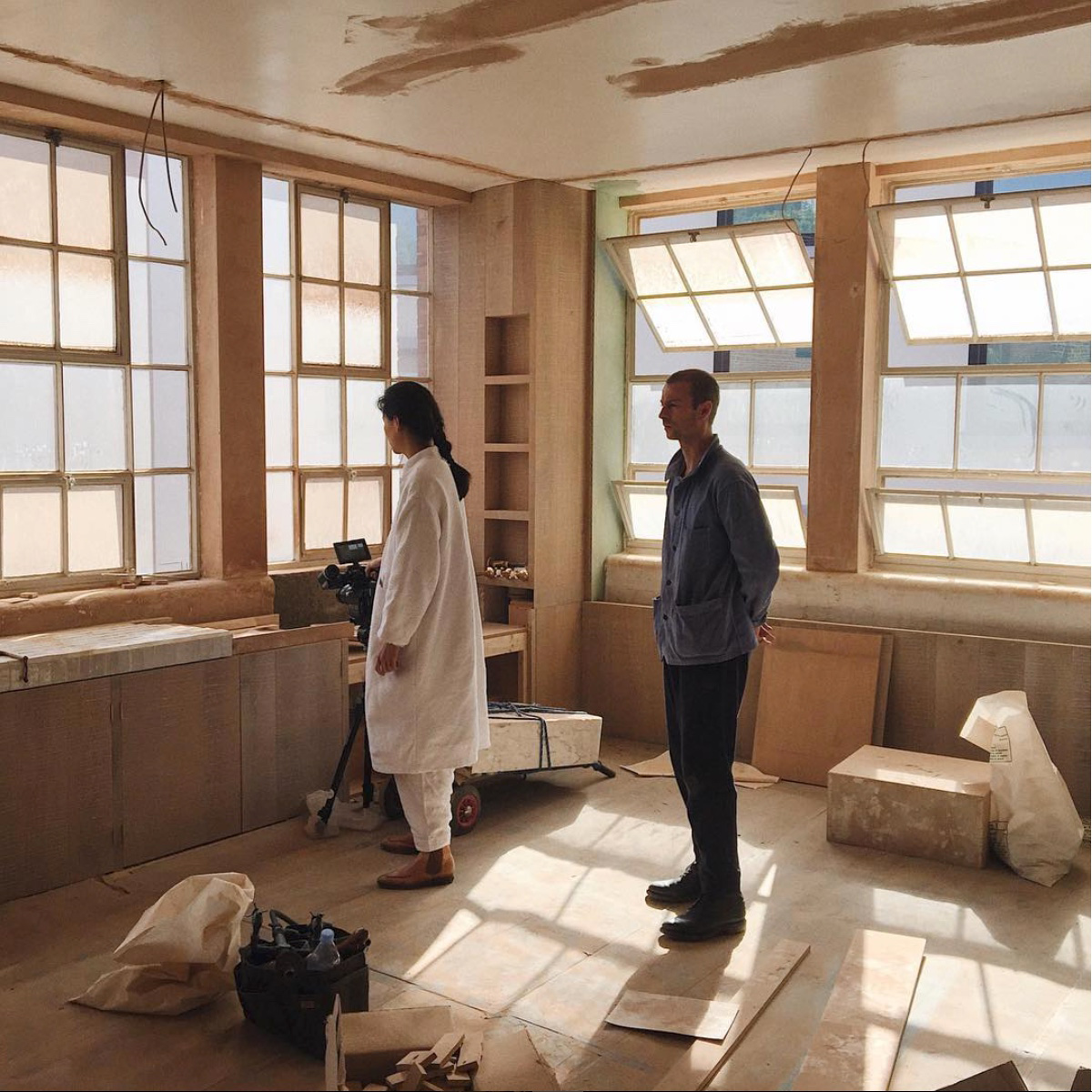
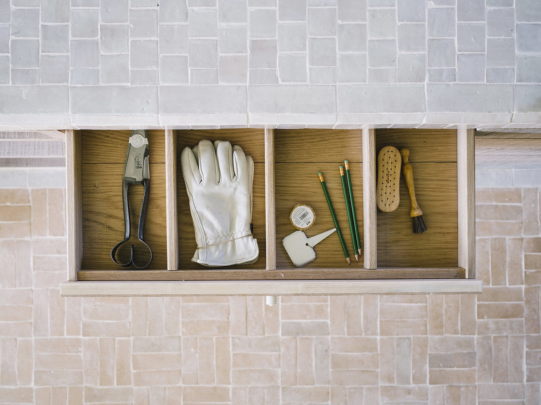
We are very proud of the level of skill and workmanship in our carpentry for this project. Every panelled wall, door, cabinet, kitchen unit and built-in piece of furniture was made on site and customised specifically for The Beldi. The panelling, doors and cabinets were all expressed in a limed oak brush timber, creating a textured, tactile and natural feel to the space.
What are your favourite pieces of furniture and objects?
We love the bright blue handmade mugs and hand-painted ceramic dishes by the late Christopher Magarshak, which line the kitchen cupboards, and the pressed texture glass jugs by Jochen Holz from The New Craftsmen. In the bedrooms, the Once Milano x Faye Toogood hand-painted quilts with pagan symbols and the baby blue and avocado baths by Water Monopoly create luxurious moments and a feeling of sanctuary.
In the living ‘room’, favourite pieces include the Zyklus chairs, which were re-upholstered in Pierre Frey velvet. We also love the Brodgar chair for the seamlessness of the carpentry and rushwork. In terms of the artwork, the series of Stephen Wright paintings inspired by the supernatural are so charismatic!
Team: Zoe Chan Eayrs / Merlin Eayrs
Photography: Taran Wilkhu for The Modern House and Toby Lewis Thomas
Film: Toby Lewis Thomas